


Yoohoo–Waving a New Flag
Your Opinion--I want it!


Saturday, June 14, is Flag Day.
This is not something I normally notice, but this Flag Day—as you probably already know—you-know-who is spending millions (estimates range between 25-45 million) of American tax dollars on a dictatorial style military parade for himself—a first for this country.
And in response, a peaceful, nationwide “No Kings” event has been organized by Indivisible for the same day, where (hopefully) millions of people will hit the streets in their local towns and cities as a counter response to this spectacle. I will be one of those people.
(The number of organized local events is staggering. If you would like to see the interactive map or find an event near you, click here.)

A New Message
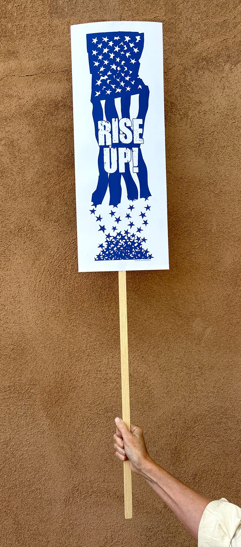
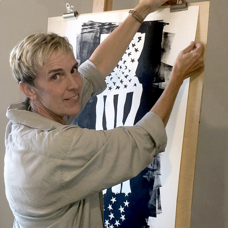
As I was musing on what sign to make for this protest happening on Flag Day, I remembered the vote poster I created in 2018 that was based on a flag artwork called Old Glory that I made after the Great Recession.
One of my sisters and I worked together to build a nationwide poster-hanging campaign for the 2018 midterms using that poster. It was genuinely one of the most positive, uplifting group political art actions I’ve ever done.
I used that poster again in 2020 as a one-woman fundraising campaign for Stacy Abrams’s Fair Fight.
Many people who read this newsletter were a part of one or both of those campaigns. Maybe you were one of them? If you were, you might see your photo in the 90-second video below.
I’d love if it you’d give it a quick watch:
2025 Reboot
While I loved that whole process and message, in this political moment, simply exhorting people to “vote” feels almost quaint. I mean, I still ardently believe in democracy and the importance of voting, but given the times we live in, voting is not enough.
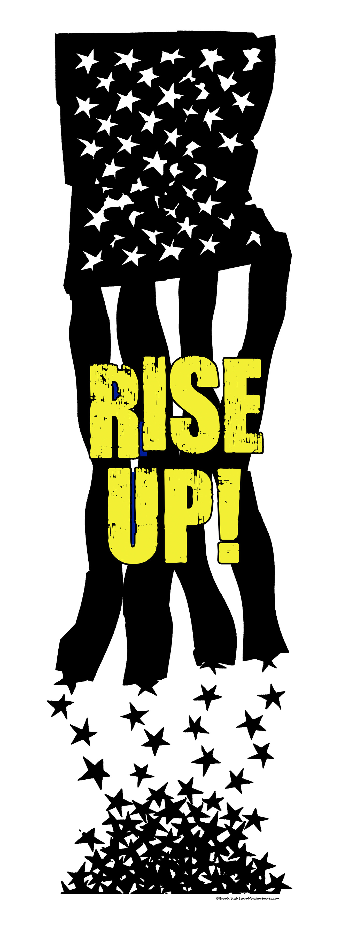
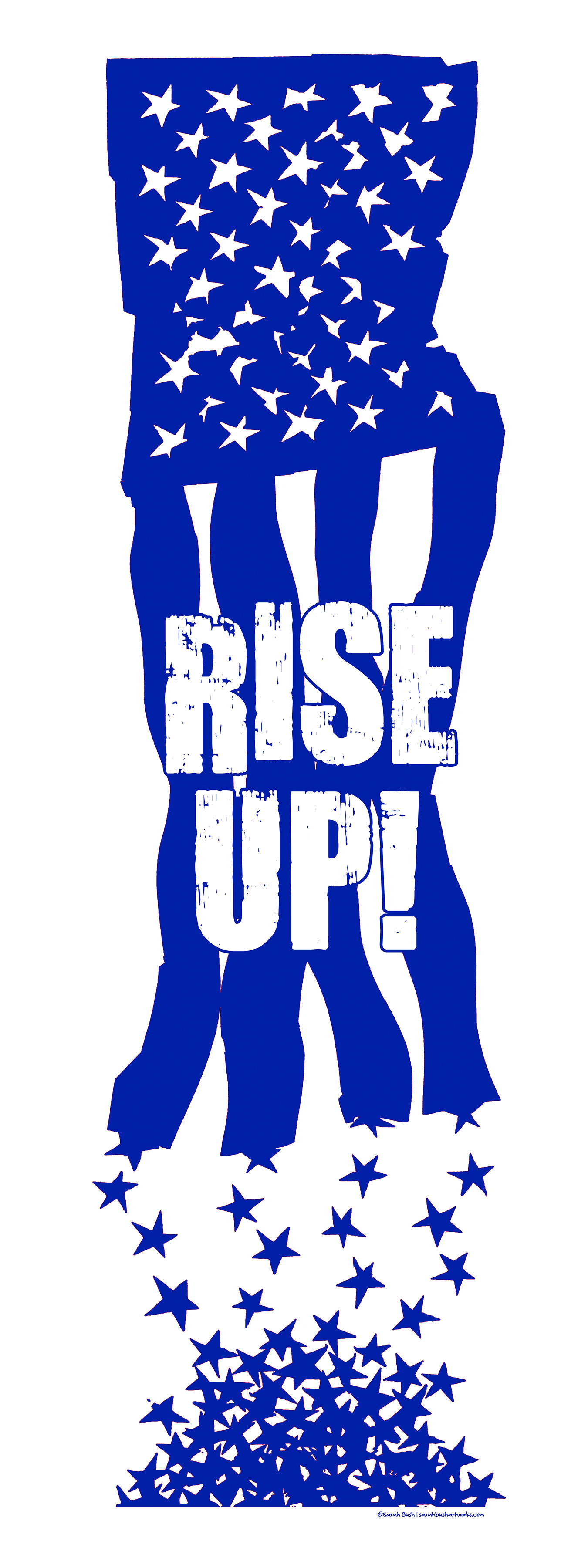
I decided my poster needed an update. So I change the word “Vote” to the words “Rise Up” and I made one into a sign for this weekend’s protest.
Well, I actually made two signs because I was torn about my color options.
Now, the wonderful thing about graphic design is that both text and image contribute equally to the final message. And different design decisions can change or shift the tone of a message, sometimes radically.
It’s especially fascinating to me to see how color itself does so much communicating on its own.
Scale also plays a much bigger role in design than is often talked about—contributing to the messaging as much as other design factors. And each, in turn, impacts the other.
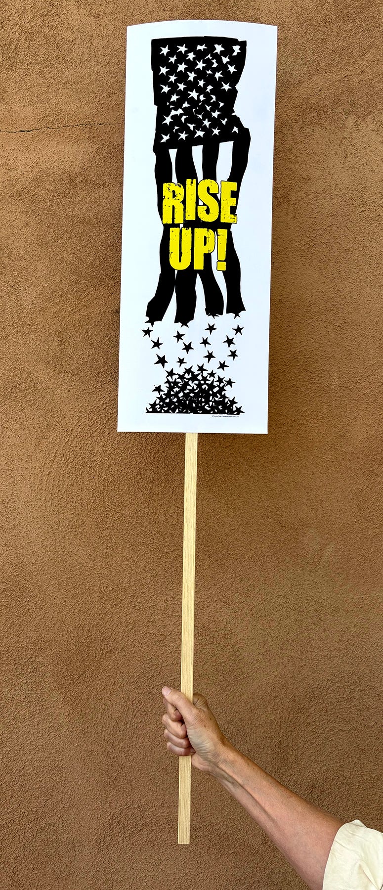
For instance, when I sent my two favorite color options of my poster to friends and family for their reactions, I felt that seeing the graphic images without being able to assess the final scale of the physical poster itself kind of exaggerated the tone or impact of each of my color options.
So I got physical prints made of both to see which was more effective in real life.
But I also did that so I could take pictures of them once I’d turned them into signs for the protest—to give you, dear reader, a sense of their scale in real life too. Because I also want to get your vote about which color option you prefer.
Offering a more accurate image of their final size would help me ensure that you have a clearer sense of what they look like as physical objects in space versus as images on a screen.
And the reason this matters to me is that I also thought it might be fun to mass-produce these and sell them as posters—if they resonate, that is. Which is why I thought it would be useful to get some feedback.
Now, if they don’t resonate with you, no worries—that’s as useful for me to know as learning that you prefer one color over the other. And if I don’t go forward with printing them as posters, I’m still very happy with the two I made for the protests on Saturday.
Your Opinion: A Very Short Poll
So. All that finally being said, I’d love your opinion. Will you answer my short poll below? (And I won’t know who said what btw!)
The question is: Which color do you prefer—Black and Yellow? Blue and White? Both? Neither?
I, of course, like them both. I also think they each convey a different vibe, and while I do have a preference, I’m good with both those vibes. Which is why I want to know your preference.
Please look at both sets of images—the two image files themselves (but at half the size of the original) and the photos of the ones I turned into signs.
Please vote on your preference in the poll below:
Thank you!
If you have any other thoughts or suggestions you’d like to share about the poster design, please feel free to hit reply or leave a comment.
And if you need a bit of uplift about our whole political situation, read this nice, hopeful essay from a substack called The White Pages by Garrett Bucks.
Upcoming Zine-Making Workshop
Speaking of the fun of working with text and images together, the June 25 Creative Change-Makers zoom call is a “zine-making” workshop—where we will play and make a fun zine or two from single pieces of paper.
This will be a relaxed exploration on the interplay of those two things. We’ll discuss design principles and messaging while I walk you through making a zine using a template I provide. We’ll then do it again with a blank sheet so you can express yourself fully, or just have another one to play with in the future.
To participate, you just need to be a paid subscriber. (Only 36.00 for an annual subscription.)
If you already are a paid subscriber, please register by clicking the link in the header or footer of this email.
If you’re not one yet, but would like to join us, just upgrade your subscription and a link to register will be in your welcome email.
To consider your options, click on this link below:
OH, you can also click here to read about the workshop in more detail.

Leave a Comment
Do you have thoughts about the role color and scale in design? Or maybe you’re attending a “No Kings” event on Saturday as well? Or maybe you’d like to say something else entirely? Good! Leave a comment. I’d love to hear.
Or lay a heart on me—that always makes me feel good.
I love this! I chose black and yellow. To me, the black represents death. Death of our democracy, our way of life, death of morality and empathy. I could go on. I also prefer black over blue because blue often represents democrats. Black might feel inclusive to all persuasions who know what is happening is wrong AND dangerous. Yellow could represent caution. It might also represent light and hope. ❤️
Sarah, I love that you brought back the flag design, which I discovered just a few years ago. I prefer black and yellow because it matches the alarm I feel about these times.